The facets of data visualisation work
Visualising the DVS 2021 State of the Industry survey
By STUDIO ANTZÉE
Do most data visualisation practitioners have just one role, or are they wearing several data visualisation hats? If so, which hats? Are certain roles or role combinations more common than others? The Data Visualization Society addressed this topic in the State of the Industry survey for 2021. This visualisation reveals the respondents' work roles—and combinations of work roles—during the previous year.
ℹ︎ Click image to see large version.
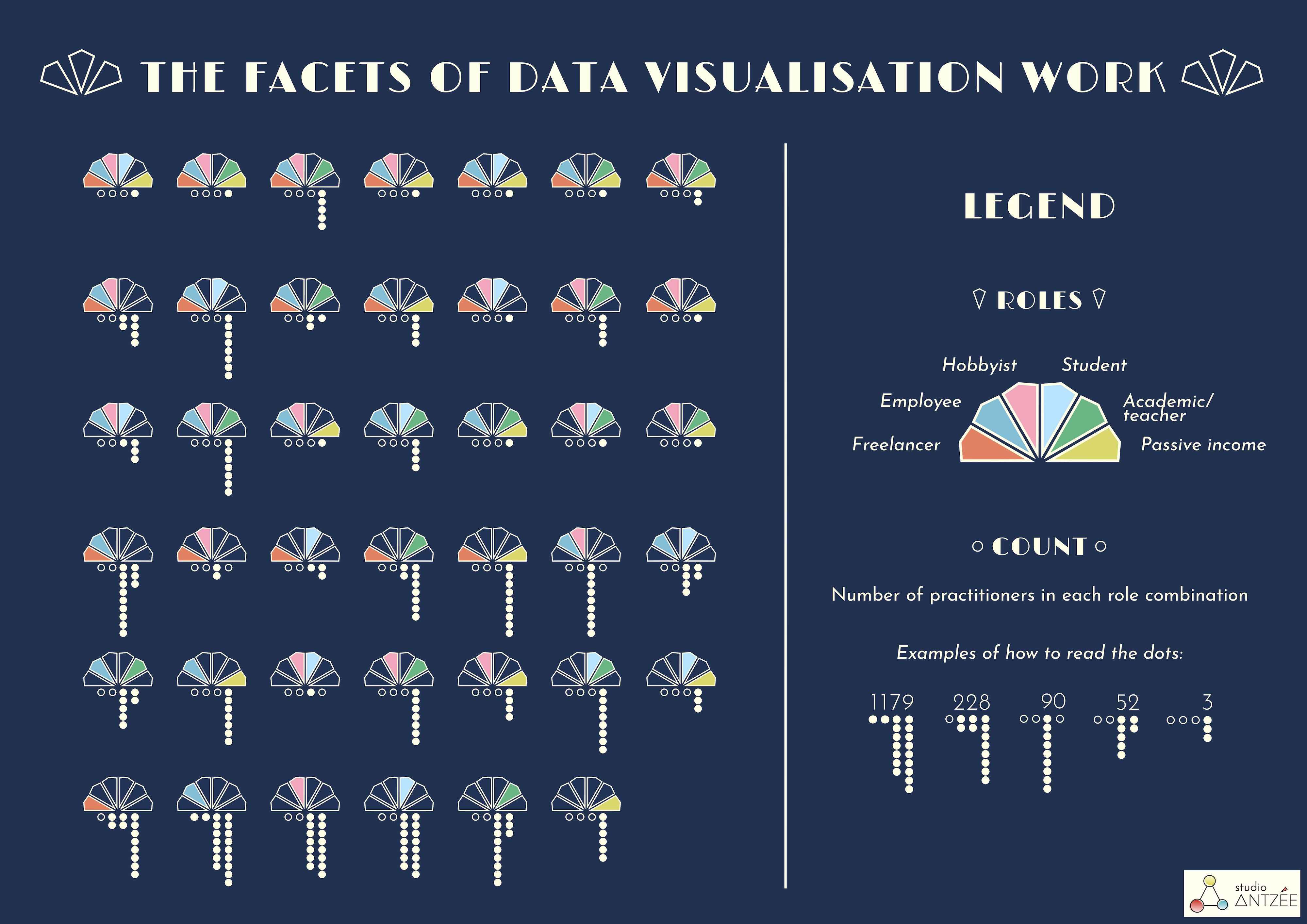
THE DATA
The chart displays the answers to the survey question "Which of the following describes your role as a data visualizer in the past year?" This was a multiple choice question with the below options:
- Freelance/Consultant/Independent contractor
- Position in an organization with some dataviz job responsibilities
- Non-compensated data visualization hobbyist
- Student in a degree program at a college or university
- Academic/Teacher
- Passive income from data visualization related products
- Prefer not to answer
2149 practitioners had selected one or more of the options—2165 if we count those who had answered "Prefer not to answer" or hadn't answered at all, but these are not included in the final chart since the visualisation aims to showcase role combinations.
HOW TO READ THE FIGURES
The 41 figures in the chart show all the different role combinations that emerged in the survey. Each figure consists of two parts:
1) The six multi-coloured facets, which represent the six roles. Where a facet has the same colour as the background, it means that this role wasn't selected.
2) The dots, which show how many people selected each role combination. The relative placement of the four vertical rows decides whether the dots represent 1000s, 100s, 10s or 1s.
ABOUT THE VISUALISATION
Inspiration for the design: Art Deco (1920s) enamel design and patterns, which I absolutely adore! The figures/chart were made with D3.js, based on a single SVG facet figure that I drew in Affinity Designer. I finally used Affinity Designer for the poster layout. Data crunching: Pandas. Thanks to Ketil, who helped when I got stuck with the D3 code.
This was my contribution to the DVS 2021 SOTI visualisation challenge. Data from the DVS 2021 SOTI Survey.